Thursday 25 March 2010

Advertisement Evaluation


This is the final outcome of my advertisement which I created using Adobe Photoshop. The aim of the advert was to advertise the release of the digi pack, therefore it was vital to ensure that the advert looked professional and attracted peoples attention, particularly the target audience.


I specifically chose an image of a brick wall as the background because it continues the ‘urban’ theme, the brick wall shot kept reoccurring in our music video and also featured on the digi pack, which is why it is also on the advertisement as symbolism which can become instantly recognisable by the audience. The title of the song and the information at the bottom of the advert is in a graffitti style font, which compliments the brick wall as it emphasises the urban setting. Graffiti may attract the attention of our target audience- teenagers/young adults, as it has associations with youth and rebellion.


The font for ‘Lily Allen’ is very similar to Lily Allen’s actual brand logo font, it important for music artists to create a brand logo for their name, which always remains the same so fans can associate it with the artist, which is why I used the 'cooper black' font on the digi pack aswell.


The colour schemes for the fonts are white and yellow, these colour stand out against the background so the visibility is clear for the audience. The song title and release date are in yellow, this colour stands out immediately highlighting the importance- letting the audience know the name of the digi pack and when it is available for purchase.


The image of Kelsey on the left side has been edited for the advert. I used Photo shop to increase the contrast settings, making the colours and the quality of the photograph stand out more. I then used the lassoo tool to cut her out and paste her on to the brick wall back ground. The photo shows Kelsey in long shot, so the audience can see the whole of Kelsey’s image, of which she is wearing the same as she is on the digi pack and in the music video, establishing her 'look' so it becomes recognisable. Kelsey has eye contact with the camera, which is a good selling point as she is connecting with the audience.


In the middle of the page is the front cover of the digi pack, to show the audience what it looks like, this looks particularly professional as many advertisements use this selling technique. I purposely wanted the image in the middle, so it is centre of the attention. Behind the image of the digi pack is the cloudy background, which like I mentioned in the planning stages, reflects some of Lily Allen’s recent cover work. The clouds contrast against the brick wall setting, which makes the advert look original and creative. I achieved this effect by cutting out brick wall shape using the magnetic lassoo tool on Photo shop, then placing it on top of the cloudy sky back ground.


I thought it was important to include extras information to add more appeal to the digi pack, for example; ‘features the no.1 hit ‘the fear’ this statement conveys Lily’s previous chart success as well as increasing the digi pack’s popularity as the audience will already know this song and this will perhaps make the audience more likely to buy it. Underneath this I put ‘And exclusive new music video!’ This is advertising the music video we created, the lexical use of ‘exclusive’ makes the video sound exciting and new, making the fans feel eager too see it. I included extracts from reviews by music magazines ‘Q’ and ‘NME’, these are top selling music magazines of Lily Allen’s genre-indie. Therefore, mentioning their high rating response to the digi pack will increase it’s appeal, making the digi pack seem like a worthy purchase.


Overall, I am really pleased with the outcome of the final product, by doing this task I developed my Photoshop skills, learning many new techniques. Eventhough I feel very positive about my work, feedback from the audience during the planning and construction process is essential. After designing my 3 flat plans, I asked teachers, class students, friends and family to give their opinion on which one they like the most, and which features are the most effective. In terms of the favoured design, the votes were rather spread out, however, I decided upon the one I chose as I saw creative potentional and thought it was the most original. In the blogs containing the flat plans I mentioned some of the suggested improvements and positive factors from each flat plan, I combined these to achieve my final product. Although people particularly liked the use of the colour red to emphasise key information, unfortunately it didn’t stand out clearly against the brick wall background, therefore I stuck to the yellow and white colour combination.


As I was constructing my design on Photoshop, I constantly asked my teachers and class friends for their opinion. This was really helpful as their advise made a lot of improvements, such as; making the fonts more visible, changing the size of certain images and fonts, to use the magnetic lasoo tool on Photo shop for certain cutting rather than the standard lassoo tool and where abouts certain objects should be placed on the page. After completing my final design, I printed some copies of my advertisement to hand out to gain audience feedback. It was also a good idea as I could see for myself what the advertisement looks like printed out and placed on a wall- I thought it was eye catching, specifically through the choices of colour. I asked people to write down their comments in response to my advertisement, some of the comments included:


‘Your advert looks really good! The colours really stand out against the background so it draws peoples attention. I also like your idea of the cloud image being cut in to the bricks, it gives the advert originality, well done.’


‘Well done Jade, this looks really professional and it’s visually interesting to look at.’


‘I like it, good use of colour scheme and the graffitti font looks effective against the brick wall. However, you could have used the NME and Q logo’s to make their quotes look more realistic.’


‘You have provided the audience with the right information and have presented it in a unique and attention grabbing way. The image of Kelsey on the left hand side could have been a bit clearer and perhaps bigger, but overall a really good job, well done.’


‘I like how you’ve kept a constant theme, particularly through the use of the brick wall. The image of the digi pack could be bigger but the way it is placed against the cloud setting looks really effective.’


Overall, I received a lot of positive feedback, which I’m really pleased with. There were some suggested improvements which are useful to know for future projects.

Digi pack evaluation

After choosing the design I wanted to do, I created my digi pack using Adobe Photo shop. Below, is an image of each dimension.


THE FRONT COVER:


I decided to use a medium close up shot of Kelsey on the front cover. I did this because a medium close up of Lily Allen is used on a recent CD cover of hers, and looks simple yet really effective. I edited the photo first, before adding it to the background. I changed the sharpness settings so that detail was more noticeable, such as the sequins on her top. I also increased the contrast settings to make the colours stand out. However, a photo of Kelsey looking at the camera might have been more appropriate as eye contact connects with the audience and would portray Lily Allen's confidence. Also, the shot is taken outdoors which affects the lighting on her face, changing the settings on the digital camera would have prevented this.

On the left side of Kelsey is a pale green background and 'Lily Allen' in 'black cooper' font. I wanted to keep the font style for Lily Allen similar to Lily Allen's own brand logo. Recent cover work also has pale coloured backgrounds, which is why I made these choices. The artists name is very visible against the background, catching the audience's attention immediately. I originally had 'Lily Allen' placed higher up on the page, but from feedback I decided to lower it as it left a large space near the bottom of the cover.

On the right side of the cover is the brick wall background, this has connection the music video, combining the two products together. I used a graffiti styled font to continue the urban theme, the font colour stands out against the brick wall background.

The different styles on either side of the image of Kelsey contrast, which may look strange as it challenges real CD cover work, however, I think it looks original and eye catching. The left side representing Lily Allen's traditional cover work and the right side representing a creative edge which is associated with the song.

BACK COVER:


I continued the background from the front cover, this looks professional as many CD covers use this technique. I also kept the same font choice and colour, for the titles of the tracks featured on the digi pack. Changing the font would make the appearance seem artificial as CD covers keep the same font style for consistency. I included details that fetaure on CD back covers, such as; a bar code- which I placed in the bottom left corner where it is traditionally placed on products. The amount of minutes in the tracks- which I placed in a smaller font next to the song title. Standard information- next to the bar code in very small font is the website, record label and the producers name. These details represent forms and conventions of real CD covers, which is why it is important that I included them in my work and presented them in that way. A suggested improvement from feedback during construction was to not include the section on the right side and just have the brick wall back ground. But I wanted to keep this part as it continues the theme from the front cover and I think it is important to include the artists name aswell.


LEFT INNER PANNEL:


In my original design, I didn't think about editing the photograph of Kelsey. But as my skills on Photoshop developed I experimented with different ways I could adjust the photograph to make it look more appealing. Using the lassoo tool, I cut Kelsey out, then went on to the filter settings to create a blurred effect. I thought it would look creative to blur the background behind Kelsey and I really liked the outcome of this effect.

Photographs are often placed in the inner pannels of CD's, so my idea is realistic. I continued with the theme, ensuring a brick wall background and using the graffitti font to write a lyric from 'everyone's at it.' The inner pannel designs are often very simplistic, but I didn't like the image alone, so wanted to include something to represent the song. Again, beacuse the photo was taken outdoors, so i should have adjusted the settings on my digital camera to improve the quality.


INNER RIGHT PANNEL:


This is the dimension where the CD is placed, therefore a simplistic idea was needed as the visibility would be imapired due to the plastic covering for the CD to slot inside. I thought an image would be appropriate, my idea for repeating the image of Kelsey came from looking through old CD collections for inspiration. The band 5ive had an album which featured this effect on the inner pannel and it looked really good, which influenced my finald design. The image of Kelsey is an exact replica from a shot towards the end of the music video, this creates a strong connection between the two products, fans will see the image and think of the music video.


During the contruction process, audience feedback was essential and it really helped to improve my work along the way. For example; changing the position of 'Lily Allen' as I mentioned earlier, to include a bar code on the back cover, increasing the size of the image of Kelsey on the front cover etc. I also asked for feedback whilst experimenting with photo editing on Photoshop, which is how I decided upon the blurred effect rather than other edit techniques. These chanegs I made during the process, improved my work and made the appearance greater in reality.


After my final product was completed I asked for feedback again, I printed each dimension on one page and handed them out to teachers, class members, friends and families and asked them to write down their responses. Some of the comments included:


'The use of the brick wall and graffiti looks 'funky' and would appeal to your target audience and you have included all the features that would appear on a real CD cover.'


'Your final designs are really good Jade. An improvement to the right inner pannel would be to use different images of shots from the music video, this would also represent the montage at the start of the music video.'


'Your digi pack is really good! Each dimension relates to one another so they are all connected. The fonts stand out, catching the audience's attention and you have chosen nice images to use.'


'I can tell you have worked really hard on this, and it shows. I like the graffiti style font! Well done, it looks great!'


'The image of Kelsey with the blurred background looks really effective and I like the idea of putting lyrics from the song underneath.'


Final music video and evaluation

So here it is! Our music video for Lily Allen's 'Everyone's at it.' ... Enjoy!


• In what ways does your media product use, develop or challenge forms and conventions of real media products?

The filming in the music video is very smooth, this is due to the equipment we had, we used a tripod rather than holding the camera. We correctly set up the tripod and made sure the camera was attached correctly. Using the tripod ensured great control without jagged movements, it particularly helped during panning movements, such as the the camera panning from the ceiling to the floor during the shot of me passed out on the floor. We often zoomed in and out of shots, this can perhaps be risky, as if it is not done correctly it can enhance shake. But we were confident to use zoom, as we received positive feedback from our media teacher during practice filming sessions. The smooth footage in our music video makes it look professional like a real music video.


In practice filming sessions, we experimented with the camera settings manually, for both indoor and outdoor shots, so we knew how to set the camera up efficiently ready for filming. We altered the white balance setting, depending on whether it was indoor or outdoor filming, this allowed us to achieve consistency in the desired tone and colours. Changing the shutter speed allowed us to adapt the exposure so we could lighten certain shots, for example; some of the indoors shots lacked lighting, such as the shots with Kelsey on the stairs, therefore the shots became even more visible when we increased the light. We started filming using 'manual focus' however, this was problematic as the camera does not know what you are aiming for and will shift focus to whatever comes in to the frame. So we decided to use 'manual focus' this was a big improvement as it allowed us to set the focus precisely before filming each shot. Using the manual focus setting meant we could achieve more complex shots, for example; pull focus. Sharp focus is elemental to reproducing a realistic image and a viewer's attention is automatically drawn to sharper areas. When this is done incorrectly it can make footage look artificial, but by using pulling focus in our music video we were able to increase the realism of our filming.


The filming of our music video was a long process, it was hard to arrange a filming session that all members of the group were able to attend to. So it was vital that there was good communication on set, so that we knew exactly what we were filming at each session. We made sure we had the story board with us on set, as the story board shows the main parts of the video and the the different locations we film in. Although the story board helped during the filming process, we created a 'shooting script' which we found more useful. The shooting script explained what happened in each part of the song in the exact seconds and minutes. This can be seen below...


As a group we worked really well together and were constantly coming up with new ideas during the process. However, something we should have planned out more is the type of camera shots and movement we were going to use in each part of the song. As we did alot of experimenting during the actual filming process and this took up time. Therefore, in our practice filming sessions, we should have experimented with shot types and camera movements and wrote down how we were going to film each shot in detail, this would have taken up less time and ensured that the person filming knew exactly what to do. Each group member had a different role during each filming session, Kelsey starred as Lily Allen so therefore did only a little bit of filming as she was in the majority of the music video. Charlotte, Lucy and I were also actors in some parts of the music video so we shared out parts of the filming of Kelsey. Lucy was the main director, she assigned our roles in each session and took charge of writing down which shot and which take of that shot it was. If it wasn't our turn to film or we weren't an actor in that particular scene, we would be assigned to playing the music or getting the next location ready.

We varied our shot types, making our filming look visually more interesting.


Above is a close up shot of Kelsey, we used these shots to show her facial expressions.


Above is an example of an extreme close up, this shot was to show greater detail in Kelsey's facial expression.


This is an example of a long shot we used, the long shots show Kelsey's body movement as well as more of the set/location.


This is an example of a medium close up, we used quite alot of these shots throughout the music video as you can see Kelsey's gestures as well as her facial expression.


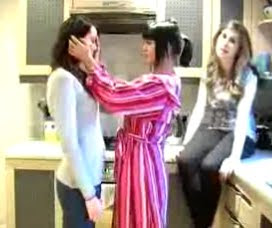
This is a group shot, as there are three actors in this shot. The group shot in this case is portraying a narrative.


This is an example of a low angled shot that we used, the camera is looking up at Kelsey. This type of shot gives Kelsey s sense of dominance and confidence. An attitude that comes across in Lily Allen's music videos.

During the editing process we made sure that the footage was in sync with the music, this was really difficult to do and was a very time consuming task but we wanted it to be perfect so that Kelsey's miming was in sync at all times, which makes our music video look professional minus any out of sync patches. There is alot of shot cutting in our music video, this is important as most music videos, particularly in an upbeat song, have lots of quick cuts. We achieved this successfully at the start of the music video during our montage. The montage shows quick cuts of shots that occur through out the video, this happens before Kelsey wakes up in bed, so it's as if she had dreamt it. Our montage idea is original and therefore challenges forms and conventions of music videos as it is not something I have seen in one before, only in television programmes for example. We also had to make sure that when we cut from a shot to another that it went in time with the music, this was achieved particularly well in instrumental parts of the song when the beat was stronger. For example; the shot of Kelsey walking down the stairs cuts to extreme close ups of her face, which flashes in time with the beat. A really nice cut at the start of the video is when a shot shows Kelsey walk in to the bathroom in her pyjamas it then cuts to a shot of her opening the bathroom door and she has a change in outfit and has done her hair and make up as if ready to go out. This cut is effective as it shows a change in time something which is done in a lot of music videos so it looks realistic. Something I think we should have done more of is cross cutting, cutting between different scenes. This editing technique is contently featured in music videos as id adds more action and makes the video look visually interesting. However, we do cross cut from Kelsey singing, to a ahot of Charlotte crouching down on a pavement smoking. This looks really effective and I wish we had done more shots like it, for example; cross cutting to extreme close ups of details on location.We included some special effects towards the end of the music video. For the line where the lyrics repeat 'at it at it at it' really quickly before going in to an instrumental, a shot Kelsey singing the lyrics 'at it' is repeated really quickly. This gives a modern effect which can be seen in some of Lady Gaga's music videos, which influenced us to use that effect. In the instrumental the music slows down, so we use the long shot of Kelsey walking across the street in slow motion, as it compliments the change in music style.


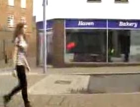
Like in many real music video's we use many different locations for filming; Lucy's bedroom, bathroom, stairs and kitchen. Also, outdoors; Newhaven town, Newhaven Alleyways and Newhaven garages. Changing sets keeps the viewers interested as something new is taking place.


During the music video, Kelsey is very comfortable in front of the camera. This is very important as a confident attitude comes across- something that Lily Allen is associated with. Kelsey uses gestures, confident body language and keeps eye contact with the audience to display this.


However, a big problem in our music video is the length of some of the shots. Such as; the scene in the kitchen and also the scene of Kelsey in mid shot walking forwards along the alleyway. This could be improved by cutting to other shots, for example; in the scene in the kitchen cuts could be made to a close up of Kelsey, Lucy carrying out tasks such as an extreme close up of her shaking the tea towel or of the Prozac in the cabinet. These are examples of cuts that could be made during the shot, this would make the scene visually more exciting and look professional- as it is very rare for real music videos to contain a still long shot without any cuts in between.


• How effective is the combination of your main product and ancillary texts?

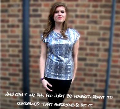
My promotion pack, which contains; the music video, digi pack and advertisement, is rather effective particularly through the use of a constant theme. The song choice for our music video ‘Everyone’s at it’ highlights the issue of drug abuse and the effects of drugs and the impact they have on peoples lives if this problem isn’t resolved. Our group immediately got an ’urban’ vibe from this song, due to it’s upbeat and modern nature, but it instantly triggered urban images in terms of mise en scene. Gritty alleyways and street corners are stereotypical places for drug use and dealing which is why we were so keen on this setting being a major part of the video, so Kelsey can walk through these areas as she’s miming the lyrics which relate to this theme. The main use of symbolism, which features on each product of the promotion pack, is the brick wall. When we first started sharing ideas we really liked the idea of Kelsey singing against a brick wall in a mid shot, when we finished filming and started the editing process we all agreed that this shot looked really effective and Kelsey stood out against the brick wall, her glamorous image contrasting with the urban setting. Therefore there are continuous cuts during the music video to this shot. I started designing my ideas for the digi pack and advertisement after my group and I were settled on our final ideas and started the filming process. We wanted to continue the use of symbolism, as we thought this would be professional, as after analysing previous digi packs and advertisements I discovered the use of symbolism- for example; the use of the cowboy hat as symbolism in Madonna’s digi pack, it features in the title, part of her costume and a prop on the back cover. But symbolism is also key as it’s something fans can recognise. Therefore the brick wall is part of the back ground for both the advertisement and the digi pack. (repetitive symbols = branding) The graffiti font used on the digi pack and advertisement also sticks to the urban theme which is portrayed in the video.


Kelsey has the same hair style and make up and is wearing the same costume in the photographs used for the digi pack and advertisement, as she is in the music video. This works effectively as it becomes a recognisable ‘look’, this image will stick in the viewers mind and trigger back to the music video when they see the advertisement and digi pack. Something Lily Allen has done on her previous CD cover work.


One of the inside pannels of the digi pack contains an image of Kelsey crouched down with a hoodied top on and a garage door behind her. This image is an exact replica of the last shots in the music video, this makes an effective combination as fans will instantly recognise the image from the video, creating a strong link between the products.


Over all, I feel the music video combines positively with the digi pack and the advertisement. However, although the brick wall was a key piece of symbolism, there could perhaps of been images of other elements of the video on the advertisement. For example, a vodka bottle on the floor, which is in a very entertaining shot of me on the floor passed out with it in my hand. Not only would it create a bigger association with the music video but the image of a vodka bottle would immediately catch the attention of teenagers/young adults, as alcohol is a big part of their life style, so this could perhaps gain a reaction from our target audience.
Also the inside of the digi pack could of conatined more images of shots from the video, for example; from the montage at the start. This would have more of an effect than using one image from the music video, as it creates a bigger emphasis towards the music video.


• What have you learned from your audience feedback?

Audience feedback is essential during the filming and editing process, even after the final product to see which factors made the music video particularly successful and which parts could of been improved up on.


Near the beginning of the process, we created a presentation, containing all our first ideas for our music video. The presentation included; song choice, narrative for the video, mise en scene elements and our target audience. We presented this information as a 'pitch' to our media class and teacher. When we had completed our presentation we received feedback and took on suggestions for improvements to develop our ideas further. The over all response from feed back was that it was interesting song choice and they liked the way our theme linked to the lyrics conveying a message. Detailed notes on mise en scene, particularly costume/ make up and locations, but need to also focus on other elements in more detail such as; colour, lighting, staging and props. One individual explained that we didn't convey the reasoning behind some of the scenes and the fact that this may cause some confusion. Also, to place our ideas in a logical order, as we have good ideas but don't seem to understand where abouts in the music video they are going. After the lesson, we got together as a group and developed our notes on mise en scene, this was very useful as we had more of a visual image of what scenes are going to look like. We also, started to create a story board, to place the narrative in order.


In media lessons we practiced filming, to get to grips with the equipment, as well as doing practice runs of shots before filming for the final product. We received constant feedback from our teacher, which really helped as we improved upon our skills and learned new filming techniques ensuring a more professional outcome. The way we zoomed in and out of shots was done in a smooth manner which our teacher was really impressed by as it looked realistic without hesitations or jagged movements as often zoom enhances shake. The response from our teacher made us positive about continuing the use of zooming in and out of shots in our final product. But we needed to change the shutter focus as exposure needed to be lightened for clearer footage. Also, to use a tripod for panning shots, as we hand held the camera for a shot where the camera panned slowly from up to down, this will avoid jolts in the future for smoother filming.

When we had filmed all of our footage and started the editing process in media lessons, we asked for feed back from our teacher, other media students and friends. This enabled us to constantly make improvements to our video as we went along. The feedback was generally positive on what we had produced so far, but there were suggested improvements, for example; alot of the shots were to long, therefore we took this on board and added more cuts in, such as; the shot of Kelsey walking down the stairs, we added quick cross cuts of extreme close ups of Kelsey's face, this also complimented the beat of the music making it more effective. There were also some parts of the video that were out of sync, which we adjusted immediately. Also, to repeat some of the shots that look particularly effective, for example Kelsey singing against the brick wall.


We continued editing our footage making constant changes in response to the feedback and completed our final product. Again, we asked teachers, class members, friends and family for their opinions on our music video. I had a note book which I asked people to write a comment in response to our music video. Some of the comments included:


'Really good music video, it's great that Kelsey is so confident infront of the camera.'


'Your group have worked really hard on this project, the camera work is really smooth which looks professional and there is some nice editing, particularly the cuts at the starts of the video. My only concern is the length of some of the shots, but over all great work guys.'


'I enjoyed watching your music video, it was a good song choice and it looks really good.'

'Well done, the video looks professional especially with the special effects towards the end.'


• How did you use media technologies in the construction and research, planning and evaluation stages?

The internet was our main media source for the majority of our research. We used‘youtube.com’ to watch Lily Allen’s previous music video’s to gain inspiration and to look out for any common

characteristics. We also used youtube.com and music channels to watch other music videos, too see how music videos are constructed, to seek inspiration and too look out for specific shot types/editing techniques which may help to expand on our own ideas.


When researching for Lily Allen’s target audience, we used websites such as; Lily Allen music.com, en.wikipedia.org/wiki/Lily_Allen, myspace.com/lily music and face book.com. These websites, aswell as search engines, allowed us to look at Lily Allen herself in more detail too, including; her personality, her appearance, about her life and her music style in general. This was really useful to create a realistic portrayal of Lily Allenm in our music video.


Photographs are always important in planning and research stages, each group member had a digital camera, so we were able to take various photos of; set locations, costume designs and shot types.


For the actual filming of the music video we used dv cameras, we ensured that we had many practice uses so that we had perfected the right teachniques ready for filming. This involved changing the settings, practicing different shot types and camera movement and using additonal equipment such as the tripod.


In the editing process, we used the programme ‘final cut pro’ on the apple mac laptops, although Lucy and I have had experience on the programme ‘windows movie maker’ it was still really tricky to get to grips with this programme. The editing process was tricky and time consuming, but we all took turns in editing certain parts and discussed ideas together whilst a group member was taking their turn to edit, to ensure it was a group effort.

Thursday 4 March 2010

Advertisement designs

I sketched 3 flat plan designs for my advertisements...


1)


My first design was influenced largely by the advertisement I analysed of Nelly's. I like the way he used a photograph of the CD front cover, to show the audience what it looks like. So I decided to do the same for my digi pack. The background behind the digi pack is of a brick wall, this continues the urban theme, the brick wall featured on my digi pack and throughout the music video, so it's use of symbolism, linking all of the products together. 'OUT NOW!' at the top of the page is going to be in the same graffiti font as I used on the digi pack, as I received positive feedback for using that font and continuing with the theme. I chose the colour red as it catches the attention of the audience. 'Lily Allen' is in a large font underneath the picture of the digi pack, I will use the same 'cooper black' font as I did on the digi pack, creating a brand logo that fans will associate the artist with. 'EVERYONE'S AT IT' will also be in a graffiti font but in the colour white as I thought it stood out agianst the brick wall in my digi pack. I have included ratings from top selling music magazines Q and NME. Including a high rating from popular magazines enhances the sale as the audience will think it is a worthy purchase.


After completing my first flat plan I asked other for feedback on how I could improve this, as this will help me when I plan my other designs. They liked the use of the colour red for 'OUT NOW' as it catches attention, therefore I will remember to use this colour again. Also, the fact I've used the same fonts and brick wall background as I did on the digi pack. However, improvements suggested were: to appeal more to my target audience and to represent the genre by including a photograph of Kelsey as well as the digi pack and to include extra details about whats featured on the digi pack to make it sound more appealing.


2)


The background colour is the same pale green colour that I used on the left side of the digi pack, I will use a medium close up photograph of Kelsey to place in the middle, taking up the majority of the page. Kelsey has a cheeky smile, representing Lily Allen's mischievous attitude and she has direct eye contact with the camera, to connect to the audience. The font for 'Lily Allen' will again be in the font 'cooper black' to continue the brand logo. However, instead of a graffiti styled font, I am going to use a more feminine and sophisticated font. This advertisement reflects Lily Allen's recent CD cover work. The colours of the text for the information at the bottom of the page will be black as this will stand out against Kelsey's silver coloured top. I have included an image of the digi pack in the bottom right hand corner, similar to Katy Perry's advertisement, so the audience still get to see what the digi pack looks like. In response to the audience feedback, I included extra information on this design; 'FEATURES THE NO.1 HIT THE FEAR." This conveys Lily's recent chart success and is a well known, popular song which will increase the chance of people wanting to buy it. "AND EXCLUSIVE NEW MUSIC VIDEO" The lexical choice of 'Exclusive' makes the video sound exciting and brand new, something fans will be eager to see.


After completion of this flat plan, I also asked others for feedback. They liked the fact I used a large image of Kelsey as this will attract people's attention, also the way I included the digi pack underneath. They said how this one was an improvement on the last as I included additional information. But they liked the way I continued the theme from the digi pack in my last design where as this one doesn't so much.


3)


This is my final flat plan, I wanted to create an original design that includes the suggested improvements. I decided to use the brick wall background again, as I received alot of positive feedback from continuing the urban theme and keeping consistence as it was used for the digi pack. But I wanted to add something unique to the advertisement and as I was looking on a Photoshop website I saw this picture:


I really like this idea, and wanted it to be in my design. So I thought I could have an image of the digi pack inside, but with a background behind that. As I looked through Lily Allen's recent cover work, there was a CD cover with a cloudy background, so I decided to put that behind my digi pack. The cloudy sky image contrasts with the brick wall, representing the urban edge of the track 'Everyone's at it' as well as Lily Allen's usual cover work. I kept the font choice for Lily Allen to continue the brand logo and as I was using the brick wall again I went back to the graffiti style font. 'EVERYONES AT IT' will be in the font colour yellow, 'RELEASED MONDAY APRIL 5TH' Will be in red and 'FEATURES NO.1 HIT THE FEAR AND EXCLUSIVE NEW MUSIC VIDEO' will be in white. These colours stand out against the background, catching peoples attention. The release date is in a slightly larger font than the information above it, as it is really important that the audience is aware of when they can buy the product. On the left side of the page, underneath 'Lily Allen' is a long shot photo of Kelsey, she is wearing the same outfit as in the music video and she is posing with a Lily Allen style attitude against the wall and has direct eye contact with the audience. I decided to improve the authenticity of the advert design by including quotes from NME and Q rather than just ratings, which I think looks more professional and convincing.


I asked for feedback on my final design, and due to making the changes from the previous flat plans, it was generally positive. Although some people favoured the other designs, I have chosen this one mainly due to the fact that I think it has the most creative potential.

Advertisement task

Another part of our coursework is to design and create a magazine advertisement, advertising our digi pack. I will be using the programme Adobe Photoshop to create my advert, like I did for my digi pack.

I have been closely analysing examples of artists adverts to gain some inspiration before creating my own design.


This is Katy Perry's advertisement for her album 'One Of The Boys'. The details included are simple and minimal, but get across the main point, including; title of the single, date of release and that it features her number one single 'I Kissed A Girl'. The font is bold and in the colour white, which immediately stands out in the bottom right corner, against a darker background.

The artists name 'Katy Perry' is in the colour pink and is in a curved form, these aspects represent a feminine side. The colour and font size immediately draw attention, so the audience can see instantly recognise her name. This exact font style is used on the album cover as well, so perhaps it's her brand style, so the audience associates that style of font with her name.

The background image shows Katy Perry in a garden setting, the setting includes a white picket fence and red roses, the typical American dream styled garden, with a paddling pool and rubber duck, which also sets a summery scene. The same background is used in the background of her album cover, which is keeping the same theme, making it recognisable. Katy is wearing very feminine clothing of the 1950's pin up girl style, her clothing is different to on the album cover, yet it is the of the same style.

This advertisement could attract both males and females, Katy Perry's image is 'sexy' which will instantly catch the eyes of males and females will be drawn in by the general feminine mise en scene.

I really like the way that the background is a setting which matches her image, the perfected garden set works with the 1950's summery style. Also, I like the way the background setting is the same as the one on the album cover, this is something I am going to consider when designing my own advertisement as I think it looks particularly effective. I am also going to have a small image of the digi pack cover like it has been done on Katy Perry's advertisement.


Although this artist is of a different music genre, I thought it would be interesting to look at designs from other genres, to get further inspiration to make an authentic advertisement but also to identify differences between genres, to see how different genres relate to their audience.


Above is the advertisement for 'Nelly's' album. The background colour is black and on the album cover he is topless, looking down and showing his fist, these aspects represent masculinity creating the image of being tough, which is often seen in the hip hop genre.

The font colours are blue and white, blue further represents the idea of masculinity and white clearly catches attention against a black background. The font style and colours on the advertisement are the same as on the album cover, creating an association with the artist, something I'm going to consider when designing my own advertisement. Like the Katy Perry advertisement, it contain a few minor but important details, such as; release date and the featured singles that have been in the charts which will attract fans.

Thursday 25 February 2010

Changes to ideas

As we started the filming process, we changed and developed some of our original ideas. Kelsey is now going to be 'Lily Allen' as she felt more comfortable miming the lyrics and had the appropriate Lily Allen attitude that was needed. We decided to change the idea for the beginning of the video, we decided it would be quite hard to do the classroom scene, because we would need to film it during college hours and we would need a classroom full of students to make it realistic. When we were arranging the filming schedule for this scene, it proved to be hard due to finding enough students available and being able to wear the appropriate clothing for the scene. But we still like the idea of zooming in to the eye to the start the story, as through filming practices it looked very effective. But we changed the idea from the classroom, to the idea of waking from a dream. At the start of the song, there is an instrumental that is very fast and upbeat, we decided to create a montage of brief snippets of the video in a random order in a fast cut edit, it would then cut in to Lucy's eye and zoom in before the first verse starts.

For the lyrics to...


'I don't know much, But I know this for certain,

That is the sun, Poking its head round the curtain.

Now please can we leave, I'd like to go to bed now.

It's not just the sun, That is hurting my head now.

I'm not trying to say, That I'm smelling of roses,

But when will we tire, Of putting shit up our noses. '

A close up of Kelsey shows her asleep in bed and then she awakes, and mimes to the lyrics whilst sitting up and using some movement and hand gestures in response to the lyrics, the camera movement switches between mid shots and close ups to switch emphasis between facial expressions and body movements. A long shot is then used to show Kelsey get up from out of bed and walk towards the camera. For this scene in the bedroom, we used Lucy's bedroom, it is a modern styled bedroom and we made it slightly messy for effect, Kelsey is wearing pyjama style clothing.

Then for the lyrics...


"I don't like staying up,

Staying up past the sunlight.

It's meant to be fun,

And this just doesn't feel right."

Kelsey opens the bedroom door which leads out to the hall way, on the floor is me lying down asleep in a drunken state with a vodka bottle in my hand and make up smudged on my face. A long shot is used from the other side of the door to show Kelsey opening it then, the camera then pans down to show me lying on the floor and Kelsey tip toeing over me, the camera then pans up to a close up of Kelsey's facial expression showing her reaction to seeing me like that on the floor, she then exits to her left in to the bathroom.


Then for the start to the chorus, for the lyrics...


"Why can't we all,

All just be honest,

Admit to ourselves,

That everyone's on it. "


A mid shot shows Kelsey opening the bathroom door in a change of clothing and perfected hair and make up, looking directly at the camera miming to the lyrics. We have kept the outfit and make up style that we were going to use originally. The aim of this shot is to show the transformation in to a party/clubbing style look.


For the remaining part of the chorus, to the lyrics:

"From grown politicians,

To young adolescents,

Prescribing themselves, Anti-depressants.

How can we start to tackle the problem,

If you don't put your hands up,

And admit that you're on them.

The kids are in danger,

They're all getting habits,

Because from what I can see, Everyone's at it.

Everyone's at it.

Everyone's at it.

Everyone's at it."


A low angled long shot is set up from the bottom of the stairs leading down form the hall way. Kelsey is at the top of the stairs, she slowly walks down and continues to mime the lyrics. On the 5th step is a pair of black patent high heels, she sits down and puts them on. It transfers between mid shots, close ups and the long shot whilst she is sitting. Then she stands up again and for the end of the chorus when the 'Everyone's at it' bit starts, it is very slow, so Kelsey slowly walks down a step at a time walking towards the camera at the bottom of the stairs.


For the second verse, the scene takes place in the kitchen. Kelsey is sat on the kitchen surface between the cooker and the sink. There are props in the shot such as; a kettle, toaster, fruit bowl, kitchen cupboards etc. To give an atmosphere of a homely spotless kitchen. Lucy is playing a mother in the scene, she has her hair tied back a dressing gown and no make up on, in a stereotyped manner, Lucy is cleaning the surface around Kelsey and folding a tea towel to put over the oven handle, completely oblivious to Kelsey being there, who is looking at the camera miming the lyrics. For the part of the lyrics:


"You go to the doctor,

You need pills to sleep in.

Well if you can convince him,

Then I guess that's not cheating.

So your daughter's depressed,

We'll get her straight on the prozac."


I enter the shot looking dismal and rubbing my eyes, Lucy feels my temperature and gives me a cuddle, then reaches up in to the cupboard to give me some pills. A long shot is used to capture all three of us in the scene. But we will also film a close up of Kelsey singing the second verse so we can cut between the two shot types. An extreme close up of Kelsey is used at the end of the verse for the line "But little do you know, She already takes crack. " Kelsey looks directly in to the camera in a very attitudinal manner.


For the second chorus, we have continued the walking along the street idea, but we have changed the location from Lewes to Newhaven. This is because, Lucy's house is in Newhaven, and we found some streets in Newhaven that are far more grottier which is more appropriate for the theme. Different shots of Kelsey walking, such as long shots, mid shots, close ups and extreme close ups of detail such as; her feet walking and objects on the ground. These shots will be cut between Kelsey singing against a brick wall.


The photo above is an example of a shot that we are going to cut to whilst Kelsey is walking through the alleyway. Charlotte is lighting up a cigarette crouched down on the floor, the pavement of the alleyway looks filthy and has lots of cracks in it, there is also a housing estate in the background giving the effect of an urban grotty environment, the look we were going for.


This is where we filmed the brick wall shots in Newhaven town, the camera is on a tripod for smooth filming, particularly for zooming in to different shots of Kelsey.


Above is a photograph of an example of what a close up shot of Kelsey would like against the brick wall.


This is a long shot of Kelsey before we do the alley way shots.

Story Board and Animatic

After discussing and further developing our ideas, we decided to create a storyboard, to plan out the key points of our music video in correct order with the lyrics. Each group member made valid contributions to put forward and took part in drawing and designing the story boards.


This is the first page of our story board, the first drawing summarises our idea of the class room scene, showing the staging we've considered. The second drawing is a close up of Lucy sitting at the desk, looking bored and uninterested in response to the teacher. The third drawing is of Lucy's eye, representing the idea of the camera zooming in to her eye and changing in to the next scene, out of the classroom. The fourth drawing is of Lucy walking down an alleyway, with a confident attitude miming the lyrics to the song. The fifth drawing is a shot of Lucy singing against a brick wall which will be used frequently in the video, for example cut in to parts of the chorus. The sixth drawing is an idea we had that Lucy could spin off from the wall before it cuts in to a different scene.


This is the second part of the story board. The first drawing shows some teenagers crouching together in the streets of the night and it is assumed that they are taking drugs. The second drawing represents a long shot showing Lucy walk across passed the teenagers taking drugs. The third drawing is of a teenager on the pavement floor passed out from a heavy night with a bottle of vodka in their hand. The fourth drawing is of Lucy walking down the alley way again but this time people are seen walking by in a drunken and disorderly manner. The fifth drawing shows a couple under the street light having a kiss, both dressed as if they have been to a party/clubbing with alcohol in their hands. The sixth drawing is of a man who shows behaviour and looks like he is on drugs, he tries to grab Lucy but she pushes him away.


This is the third page of our story board, the first drawing represents an extreme close up shot of a doctors hand giving over a prescription. This fits with the lyrics 'you go to the doctors you need pills for sleeping'. The second drawing represents a scene in the kitchen, it shows a long shot of a mum in the kitchen doing house work/cooking tasks. The third drawing is still in the kitchen and is a medium close up of Lucy sitting on the kitchen surface, her legs dangling and singing to the lyrics watching the mum. The fourth drawing is of the daughter coming through the kitchen door, looking unhealthy and as if shes come home the next day from a heavy night out. The kitchen scene matches the lyrics 'you're daughters depressed get her straight on the Prozac, but little do you know, she already takes crack.' The fifth drawing is an extreme close up shot that can be used at various parts of the chorus during the video, of Lucy's lips miming the lyrics. The sixth drawing is of two grown men in suits in an important meeting which matches the lines 'from grown politicians'.


This is the fourth and final page of our story board, the first drawing is off a group of people at a drug counselling session, getting help for their addiction. Lucy circles the group with a feeling of positivity as they have gone to get help. The second drawing is of Lucy walking down a street at night there is no one on the streets this time and she appears happy and less fearful. The third drawing is of the classroom scene again, Lucy returns from her imagination back to reality towards the end of the anti drug lecture. The fourth drawing is of a close up of Lucy sitting at her desk miming the final lyrics on the song. The fifth drawing is a long shot showing the kids all relieved and dashing out of the classroom apart from Lucy. The sixth drawing is of Lucy left alone in the classroom at her desk deep in thought, the final shot of the video.


After making our story board, we made an animatic, featuring the images from our story board. This helped allow us to get sense of the order of shots and also to get idea of where shots can be cut and by doing this task we also gained experience of using 'Final Cut Pro' on the Apple Mac laptops.